Pages

Saturday, June 3, 2017

Comparing four modeling approaches: System Dynamics, Agent-based Modeling, Cellular Automata, and Discrete Event Simulation using a SIR model as an example

Over the years several modeling styles have been developed but often it is unclear what are the differenced between them. In this post, Dr. Crooks and I would like to compare and contrast four modeling approaches widely used in Computational Social Science, namely: System Dynamics (SD) models, Agent-based Models (ABM), Cellular Automata (CA) models, and Discrete Event Simulation (DES). To compare and contrast the differences in how these models work and how their underlying mechanisms generate outputs, we needed a common problem to test them against with the same set of model parameters. While one could choose a more complex example, here we decided to choose one of the simplest models we know. Specifically, we chose to model the spread of a disease specifically using a Susceptible-Infected-Recovered (SIR) epidemic model. Our inspiration for this came from the SD model outlined in the great book “Introduction to Computational Science: Modeling and Simulation for the Sciences” by Shiflet and Shiflet (2014) which was implemented in NetLogo from the accompanying website. For the remaining models (i.e. ABM, CA, and DES) we created models from scratch in NetLogo. Below we will introduce how we built each model, before showing the results from the four models with the same set of parameters, which allows us to compare the results of the models. The source code, further documentation for the four models can be found here.

System Dynamics
In the system dynamics model from Shiflet and Shiflet (2014), one person is infected at start. Infected people can infect susceptible people. The population of infected will always increase by (number of infected * number of susceptible * InfectionRate * change in time dt). The infected people may recover. The amount of people that will recover in an iteration is always equal to (number of infected * RecoveryRate * change in time dt). Figure 1 illustrates the system dynamics process while Figure 2 shows the SIR process as a flowchart.

Figure 1. System Dynamics process (Source: Shiflet and Shiflet, 2014)


Figure 2. System Dynamics flowchart

Agent-based Modeling
As in the case for the SD model, at the beginning of the simulation, one agent is infected. Agents are randomly distributed on the landscape, and in the beginning of each iteration, they turn to a random direction and move forward by one cell. During each iteration, an infected agent may infect other agents on the same cell. This is different from how the SD model works, specifically the probability of getting infected. In the SD model, the infection rate is the infection rate on the entire population. In the ABM, the probability of becoming infected is equal to the infection rate divided by the probability of an agent to be in the same cell, multiplied by the change in time. Each infected agent has a probability to recover in each time period, which equals to the recovery rate times the change in time. The equations in the ABM are:


Where P(same cell) = probability to be on the same cell, equals 1 divided by total number of cells; dt = change in time. Figure 3 illustrates the agent decision process. Figure 4 shows the display of the ABM.


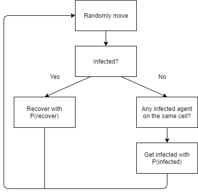
Figure 3. Agent-based Modeling: agent decision process


Figure 4. Display of the ABM. Green = susceptible. Red = infected. Blue = recovered

Cellular Automata

At the beginning of the simulation, one cell is infected. During each iteration (dt), the infected cell can infect other cells in its Moore neighborhood (i.e. 8 surrounding cells). The landscape will be a n by n square, and n is equal to the square root of the number of people to be created at the beginning of the simulation. Wrapping is enabled both horizontally and vertically. Similar to the ABM, we would like to map the probability of becoming infected to the one in the SD model. In the CA model, the probability of becoming infected is equal to the infection rate divided by the probability to be in the Moore neighborhood, multiplied by the change in time. Each infected cell has a probability to recover in each time period, which is based on the recovery rate multiplied by the change in time. The equations here are:

Figure 5 shows the changing process of the cells. Figure 6 shows the display of the CA model.

Figure 5. Cellular Automata cell changing process

Figure 6. Display of the CA model. Green = susceptible. Red = infected. Blue = recovered.

Discrete Event Simulation
In a Discrete Event Simulation model (aka queuing model), there are three abstract types of objects: 1) servers, 2) customers, 3) queues which is different from CA and ABMs.
So to implement a SIR model as a DES Servers are the processes of becoming infected and recovering. The durations people stay with the servers represent the process of becoming infected and getting recovered. Customers are susceptible people to be infected, and infected people are waiting to recover. We assume there are two queues in this model. As susceptible objects (i.e. individuals) are created, queues for infection are formed while people are waiting to be infected. On the other hand, as people get infected, they form a second queue waiting to recover. During each iteration (dt), each object in queue has a probability to get become infected. Each infected agent object has a probability to recover which is equal to RecoveryRate. After agents recover, they enter the sink of recovered people. The equations can be written as follow:
The whole process is illustrated in Figure 7.


Figure 7. Discrete Event Simulation process

Results from the Implementations
Now that the models have been briefly described. We turn to how using the same set of parameters lead to different results. The default parameters being used in each model are: number of susceptible people at setup = 2500, Infection Rate = 0.002, Recovery Rate = 0.5, change of time (dt) = 0.001, and the numbers of people in each status are recorded. Since the SD model has no randomness and will always give the same result, it is run only once. Each of the other three models were run for 10 times (feel free to run them more if you wish), and then we took the average of the ten results and show them in Figure 8. The stop condition is that no individual left to be infected.

Figure 8. Results for the different models. Clockwise from top left: SD model, ABM, DES and CA

In the four models, we observe the same pattern: the number of susceptible people decreases, the number of infected people increases first and then decrease again, and the number of recovered people increase over time. However, each model realization also shows a lot of differences in how such patterns play out.

First of all, the SD model has the smallest number of iterations before no one is infected. The number of iterations shown on the graph are the average of the ten runs, since the runs range from smaller to larger numbers (except for the SD model, which only has one run). The SD model only took 17451 iterations to stop, while the ABM took 19145 iterations (on average), the DES model took 18645 iterations (on average). The CA model took the longest time on average for no more individuals to be infected, it took 25680 iterations (on average).

The results of the SD, ABM and DES models while appearing to be very similar to each other. In the sense, that the number of infected people increase fast at first and reaches a peak number of over 1500 at more than 2000 iterations (2272 for SD, 2403 for ABM, 2538 for DES). On the other hand, in the CA model, the number of infected people increases much slower due to the diffusion mechanism of the CA model and never reaches an amount as high as in the former models.

An important characteristic of the SD model is that there is no randomness in the model, so no matter how many times you run this model, you will get the same result. In the other three models, getting infected or recover always depend on a probability function, so there is difference in every run.

Furthermore, people in the SD model and the DES model are homogeneous, and everyone has the same probability to becoming infected or recovering from an infection, although these rates change over time, they do not vary among the different people in the population. On the other hand, in the ABM and the CA model, people (represented by moving agents or static cells) are heterogenous in the sense that they have different locations. Only susceptible people around an infected individual can be infected. It is interesting that when people can move around, like in the ABM, the result is similar to the SD model, though the ABM takes a little more time to recover (19145 iterations in ABM vs. 17451 iterations in SD). When people are static and the number of people on the same space is limited (one cell in one space in this case), like in the CA model, the infection process becomes slower and it takes longer for everyone to recover.

To test the model, I have increased the infection rate in this model to 0.02, and the results are shown in Figure 9. As the infection rate has increased, the number of susceptible people decrease much faster this time. However, the SD model, ABM, and DES model are still similar to each other, while the infection in the CA model is slower. The average number of iterations for these models are: 15807 (SD), 15252 (ABM), 16937 (CA), 16677 (DES). The total number of iterations of each model has decreased this time, and the CA model still takes the longest time to converge. The peak of infected people in each model are: 2363 people at 255 iterations (SD), 2310 people at 363 iterations (ABM), 2035 people at 1019 iterations (CA), 2340 people at 286 iterations (DES). The CA model takes a longer time and reaches a lower peak.

Figure 9. Results for the different models with infection rate = 0.02. Clockwise from top left: SD model, ABM, DES and CA

These models are only simple examples of how a SIR model can be implemented in different modeling techniques, but in reality, if we were to model disease propagation in more detail we would need to consider many other things such as people could be both moving through space (i.e. traveling to work) and static (i.e. staying at home), and the capacity of each cell is always limited to some amount.

Reference
Shiflet, A. B., & Shiflet, G. W. (2014). Introduction to computational science: modeling and simulation for the sciences. Princeton University Press.

Wednesday, February 22, 2017

A location model based on rent

I have developed a location model based on rent. In this model, the rent of each cell is calculated by taking the average of agents' income in this area. Agents have different income levels and requirements on space. Agents want to be located in the most accessible area they can afford where their preferences for space are matched.

There are two types of agents: residents and employers. Residents have high income (e.g. financial services), middle income (e.g. teachers and other professional occupations) and low income workers, which are classed as ‘commerce’, ‘service’ and ‘industry’ respectively. These classes are additionally broken down by age as young (18-34), middle aged (35-65) and old (66+). The agent’s age is calculated randomly when it is first created (18-67). Each agent desires a certain amount of space which is broken down by age categories.

Employer agents were designed to reflect the residential agents’ employers, and subsequently the same three groups of ‘commerce’, ‘service’ and ‘industrial’ were used to represent employers’ different roles instead of age, they have a tenure set between 0-6. employer agents’ decrease their tenure to zero. Once zero is reached, the employer can move. As with residents, employers have a space requirement. For example industrial firms are driven by the need for large amounts of land while financial services (i.e. ‘commerce’ employer) need less land but want a more central location. Each employer also has an income which is four times that of residents.

It is assumed that younger residential agents will move more frequently (every 2 iterations on average) than those who are middle aged (every 5 iterations) with the older residents moving the least (every 10 iterations, On the other hand, employers only move if their tenure is 0. Once an employer agent has moved and finds a suitable location, its tenure is reset to 6 and cannot move for 6 iterations of the model.

Agents of either residential or employer type wanting to be located in the most accessible area they can afford where their preferences for space are matched. An alternative zonal system is used, based on a series of small overlapping areas which allow agents to search the entire area which is not restricted to such boundaries and allows agents to identify clusters spread across such boundaries.

When an agent decides to move, it goes through the list of areas and finds which area is the most attractrive area (in this area its based on accessability). The agent initially moves to the centre of the area, then searches the area for an affordable neighborhood.

The results with one city center:


The results with new city center:

The code can be found here: https://github.com/YangZhouCSS/Bitrent

Saturday, April 23, 2016

Walk This Way: Pedestrian agent-based model using mobility datasets

This is a Netlogo reimplementation of the pedestrian model in “Walk This Way: Improving Pedestrian Agent-Based Models through Scene Activity Analysis” by Andrew Crooks et al. The purpose of pedestrian models in general, is to better understand and model how pedestrians utilize and move through space. This model makes use of mobility datasets from video surveillance to explore the potential that this type of information offers for the improvement of agent-based pedestrian models.  

The visualization of the model looks like this:
(Grey boxes are the obstacles. Yellow triangles are the agents.)


Here is a video showing the simulation process:


There are 16 entrances and 18 exits in the model. An agent is created at an entrance, and will choose one exit as its destination. Agents move towards their destinations using shortest route while avoiding both the fixed obstacles and the other agents. The rule of selecting shortest route is simple: set the patch that one can see with the lowest gradient as target, and move towards it. One can see a patch that is both within vision and not blocked by obstacles. The method of calculating gradients will be explained in the following text.

Diagram of the route-planning algorithm:


Two types of empirical data are used in this model. Firstly, the empirical of probability of choosing each entrance and exit is used when creating agents and assigning their entrance and exits. Secondly, the empirical data of how people have moved on this map on August 25th is used to construct the gradients map, according to which agents select their path towards their destinations. The more frequently being chosen as a path + the closer to destination, the lower the gradient will be. When the empirical gradient maps are not used, the gradients map is constructed purely based on distance to destinations. Four scenarios are designed to compare the simulation results with the empirical result, in order to show how mobility data could help to improve pedestrian models.

Scenario 1: No Realistic Information about Entrance/Exit Probabilities or Heat Maps
In this scenario, entrance and exit locations are considered known, but traffic flow through them is considered unknown. Under such conditions, we run the model to understand its basic functionality without calibrating it with real data about entrance and exit probabilities, nor activity-based heat maps. This will serve as a comparison benchmark, to assess later on how the ABM calibration through such information improves (or reduces) our ability to model movement within our scene.

Scenario 2: Realistic Entrance/Exit Probabilities But Disabled Heat Maps
In this scenario, we explore the effects of introducing realistic entrance and exit probabilities on the model. The heat map models used are distance-based, and not informed by the real datasets. Instead, we use distance-based gradients (i.e., agents choose an exit and walk the shortest route to that exit).

Scenario 3: Realistic Heat Maps but Disabled Entrance/Exit Probabilities
In this scenario we introduce real data-derived heat maps in the model calibration. These activity-based heat map-informed gradients are derived from harvesting the scene activity data, however entrance and exit probabilities are turned off. In a sense one could consider this a very simple form of learning how agents walk on paths more frequently traveled within the scene. It also allows us to compare to extent to which the quality of the results are due to the heat maps versus entrance and exit probability.

Scenario 4: Realistic Entrance/Exit Probabilities and Heat Maps Enabled
In the final scenario we use all available information to calibrate our ABM, namely, the heat map-informed gradients and entrance-exit combinations and see how this knowledge impacts the performance of the ABM.

Please note that there is one gradient map for each pair of entrance and exit, therefore, 16 * 18 = 288 maps are loaded. However, the final result is compared to only one path frequency map which is an empirical data obtained on August 25th. Also please note that, when the entrance/exit probabilities table is used, some entrances are exits have a probability of being chosen equals to zero. While the table is not used, agents just randomly choose any entrances or exits.  

Please find the model here:
https://github.com/YangZhouCSS/walkthisway

Monday, February 15, 2016

Pedestrian model of agents exiting a building

I built a model of pedestrians who try to leave the floor through one or two exits. The map being used is from GMU’s Krasnow Institute. The model records the frequency of each cell being chosen as a path and draws the result into a path graph, which can be exported to ArcGIS for further analysis.

Here is a graph showing the path graph opened in ArcGIS:  


Here is a video showing the simulation process:


Each pacth has a variable called elevation, which is determined by (1) the shortest distance to the exit; (2)if it is in a room, elevation is lower being closer to gate. If there are more than one exit patches, the elevation is equal to the shortest distance to closest one of the exit patches. People use the gravity model (always flow to lower elevation, if space is available) to move to the exit.


In this model, the “elevation” of a patch is decided by its distance to exits as well as how close it is located to the gate of the room, so that people can run out if rooms. When running the model, people always try to move to lower elevation. This algorithm can also be used to build a rainfall model to analyze the movement of rain drops on the ground. See this link for the Rainfall model. (http://geospatialcss.blogspot.com/2015/10/rainfall-model-of-crater-lake-national.html)

I have also added the export function to export the path frequency graph to an asc file. You may open the file in ArcGIS for further analysis.

Here is the code:
https://github.com/YangZhouCSS/Pedestrian_Model_Krasnow


Saturday, February 6, 2016

Agents Exiting A Room

This is a model of agents who try to leave the room through the exit on the right hand side. The model also records the frequency of each cell being chosen as a path and draws the result into a path graph, which can be exported to GIS for further analysis.  

Here is a graph showing the path graph opened in GIS:  
In order to calculate the “elevation”, each patch calculates its distance to each exit patch, and set the lowest distance as elevation. When running the model, people always try to move to lower elevation. This algorithm can also be used to build a rainfall model to analyze the movement of rain drops on the ground.  

A video showing the process:


Code:


Saturday, January 30, 2016

Path finding model using the A-star algorithm in Netlogo

This is a path-finding model using the A-star algorithm to find the shortest path. The models uses the map of George Mason University, including the buildings, walkways, drive-ways, and waters. Commuters randomly select a building as destination, find and follow the shortest path to reach there.

The following is the original map this model uses. It has been simplified in the model for faster computation.


Here is a video showing the process:


How it works?

In the beginning, each commuter randomly selects a destination and then identify the shortest path to the destination. The A-star algorithm is used to find the shortest path in terms of distance. The commuters move one node in a tick. When they reach the destination, they stay there for one tick, and then find the next destination and move again.

The code for path selection can be simply explained as following:

Each node has a variable "distance" that records the shortest distance to the origin. It is set to be 9999 at default. The origin has distance 0.

While not all nodes have updated their neighbors:
     ask those nodes to update their neighbors
           if the distance through this node is shorter than the existing distance of neighbors, update neighbor, and updated neighbor is marked as "has not updated its neighbors"
           the node is marked as "has updated it neighbor"

The loop stops when all nodes have updated their neighbors, in other words, no node can be updated with a shorter distance. The nodes of the shortest path are then put into a list for the commuter to follow.

How is the map simplified?

For faster computation this model simplifies the original data by reducing the number of nodes. To do that, the walkway data is loaded to the 20 x 20 grid in Netlogo, which is small, and therefore, many nodes fall on the same patch. In each patch, we only want to keep one node, and duplicate nodes are removed, while their neighbors are connected to the one node left.

Also, links are created in this model to represent roads. This is so far the best way I can find to deal with road related problems in Netlogo. However, because the way I create links is to link nodes one by one (see code for more details), so some roads are likely to be left behind. But again there is no better way I can find. Therefore, I also used a loop in setup to delete nodes that are not connected to the whole network.

The code and data is here:
https://github.com/YangZhouCSS/roads/

Wednesday, November 18, 2015

Segregation Model and Calculation of Moran's I

Recently I have created a segregation model with the calculation of Moran's I, a measure of spatial autocorrelation developed by Patrick Alfred Pierce Moran. In this model, I am using the map of Washington DC.The form of data is vector data. 

Each turtle here represents a houshold that is either blue or red. All turtles want to have neighbors with the same color. The simple rule is that they move to unoccupied patches until they are happy with their neighbors.

Here is the map I am using in this model.     


In the beginning, 10 to 80 turtles are created in each polygon, depending on the population data. Turtles are either blue or red. Red polygons have 60% red and 40% blue. Blue polygons have 60% blue and 40% red.

In each tick, turtles look at two kinds of neighborhoods to decide whether they are happy or not. One is their geometrical neighboring polygons; the other is the 8-connected neighbors. If either neighborhood has different neighbors more than the specified percentage to be unhappy, turtle will move to an unoccupied patch in a polygon that is unoccupied or has the same color with it. The colors of the polygons are decided by the majority of turtles living in each of them, and the colors change every tick.

Here is a video recording the simulation process.


How to identify polygon neighbors?

It is tricky to find the geometrical neighbors of each polygon, since Netlogo does not have this function. How I did it was to use the Polygon Neighbors function in ArcGIS 10.2 to create a text file which maps each polygon to its neighbors. Then, I deleted unecessary information like headers and ask Netlogo to read the information. Notice that neighbors are polygons that share either a boundary (edge) or a corner (node).  


How to export to ArcGIS?

There is a button Export to export the map to GIS. It exports current map to finalmap.csv in data folder. Information will include color and pcentage red for each polygon. To analyze it in ArcGIS, open the csv file in ArcGIS, and export data as a dbf file to replace the oringinal DC.dbf file.


How to calculate Moran's I and verify it?

Moran’s I is a measure of spatial correlation. Values range from −1 (indicating perfect dispersion) to +1 (perfect correlation). If the different items are randomly distributed, Moran’s I is 0. There is a slider to choose whether to do row standardization or not. Row Standardization is a technique for adjusting the weights in a spatial weights matrix. When weights are row standardized, each weight is divided by its row sum. The row sum is the sum of weights for a feature’s neighbors.     

I have verified the Moran's I calculated in my model with ArcGIS, and they are the same. To verify it, open final map in GIS, create a new numeric field equal to pcetred. Then, use the tool "Spatial Autocorrelation (Morans I)" in ArcGIS. Choose the numeric field as input, "CONIGUITY_EDGES_CORNERS" as conceptualization relationship, and whether to do Row Standardization. See below for the settings.

 Compare the results.


Here is the code:
https://github.com/YangZhouCSS/Segregation_MoransI